
D9 Training Guide
The following information does not reflect the system we've developed for adding Layout Section Templates and Layout Page Templates.
Image Sizes: (this is specific to Liveon)
- Hero, Event & Articles: 1920w x 800h
- Staff: 700 w x 700h
- Simple Image & Image Carousel: 1200w x 800h
Make sure images have been optimized for the web (ideally under 250KB).
For non-Liveon sites, in general, image file size should be as small as possible while retaining the desired level of clarity. Dimensions can be determined by inspecting the placeholder image for the element the image will be placed. If unsure how and where the image will be used, you can upload an image with larger dimensions. For reference, the Penn State site doesn't use many images larger than 100KB. This includes their Hero images.
Create a New Basic Page
- Hover over 'Content' -> 'Add Content'
- Click 'Basic Page'
- Create a title for the page (Note: This is not actually output anywhere on your page, but creates your default URL pathname)
- Click 'Save'
- Click 'Layout' to add/edit content for your new page using Layout Builder.
- Make any necessary changes to the blocks
- Click 'Update'
- If you have other sections of the page you need to edit, repeat these steps
- Once you've completed all of your edits on the page, scroll to the top and click 'save layout'
Replicate an Existing Page of content
- Navigate to the page you wish to replicate
- Click 'Replicate' in the navy menu bar
- New Label: Create a new title for the page
- Click 'Replicate'
- Click 'Edit' to format your URL Alias
- Uncheck 'Generate automatic URL alias'
- Click 'Layout' to add/edit content for your new page using Layout Builder.
- Note: You may notice that certain items within a section become out of order when a page is replicated. You can easily drag/drop the blocks into the correct order.
- Make any necessary changes to the blocks
- Click 'Update'
- If you have other sections of the page you need to edit, repeat these steps
- Once you've completed all of your edits on the page, scroll to the top and click 'save layout'
HyperLinks:
Link Text Guidelines:
- Hyperlinked text should indicate the destination
- Links should avoid ambiguity (i.e. click here) and repetitive link text. (i.e. learn more)
- Consider link text size (one word to a "headline" length) not entire sentences or paragraphs
- Indicate when a link downloads a file by including the file extension (i.e PDF, DOC, XLSX)
Creating Links
- Internal Links (Links to other pages on the existing site)
- Most link fields in the new CMS include an auto-complete list of available content. To link to an internal page, start typing the name of the page in the field and then select the correct item from the dropdown and click save.
- External Links (Links to pages on other psu.edu or third-party sites)
- To link to an external page, copy and paste the complete URL into the field. For example: https://www.psu.edu/
- Email Links
- To create a link to an email address use the following format in the URL field: mailto:[email protected]
- Anchor Links
- To create an anchor link, you must first use the 'anchor' block to set your anchor ID.
- To create an anchor link on the same page as the anchor ID, you simply need to include the # followed by your anchor ID text. For example, use the following format in the URL field: #anchor_id
- To create an anchor link to an anchor ID on a different page of the site, you need to include the URL path followed by the # and your anchor ID text. For example, use the following format in the URL field: /page-title#anchor_id
- Links to Documents
- To add documents to the site, use the "Media" tab under "Content"
- Once a document has been uploaded, it will be searchable using the link functionality. Simply start typing the filename and the file should populate in the dropdown list. Select the correct file and click save.
Using Layout Builder
Manage Page Content using Layout Builder
- Navigate to the page you wish to manage
- Click 'Layout'
- Scroll to the section of content you wish to edit
- Click the pencil icon on the right side then click 'Configure'
- Make any necessary changes to the block
- Click 'Update'
- If you have other sections of the page you need to edit, repeat these steps
- Once you've completed all of your edits on the page, scroll to the top and click 'save layout'
Create a New Section
- Navigate to the page you wish to manage
- Click 'Layout'
- Scroll to the part of the page where you want to insert a new section
- Click '+ Add Section'
- Choose a layout for the section: One Column, Two Column, Three Column, or Four Column
- NOTE: Once this layout has been set, it can not be changed to a different layout.
- Configure your section:
- Administrative label: Descriptive label for the following content. (Note: This is required for accessibility purposes. Try to make it a concise description of the content to follow.)
- Is This a slider (One Column Only): No. This setting is for "Hero" sections, indicating when there is more than one item in the Hero section, create the "slider" functionality.
- Column Widths (Multi-Column Only): Set the width of your section columns.
- Sizing: Most page content will be "Box". "Full" should be used on sections with background colors/images spanning the entire width of the site.
- Top/Bottom Padding: Padding is applied to the inside of your element hence affecting how far your element's content is away from the border. Recommend using 30-40 between sections of unrelated content.
- Top Margin: Margin is applied to the outside of your element affecting how far your element is away from other elements. (Optional)
- Bottom Margin: Margin is applied to the outside of your element affecting how far your element is away from other elements. (Optional)
- Background Color: Recommended for use on "full width" sections only.
- Vertical Alignment: Controls the alignment of content within the section.
- Custom Classes: (For Internal Use Only)
- Click 'Add Section'
Add a block to a page using Layout Builder
- Scroll to the section of the page where you want to insert a new block
- Click '+ Add Block'
- Click '+Create Custom Block'
- Select a block from the list of available block types
- Enter the appropriate data/content for the block
- Click 'Add Block'
Layout Builder Block Types
Basic (Body)
- Use this block to add a basic body of text
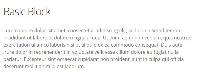
- Section Placement: This block can be placed in one-column, two-column, three-column, or four-column sections.
- Configure Block:
- Title*: Required field with the option to display or hide.
- Display Title Checkbox: Uncheck this box if you do not want to display a title for this block.
- Heading Level: Select the appropriate heading style for the block title.
- Body: Add/format your content using the WYSIWYG editor
- Block Level Padding: This can be used to adjust the level of padding between other block content.
Accordion
- Use this block to create a single row/drawer of an accordion on your page. Each row/drawer needs to be added individually. Option to include text-only title or add an icon to display.
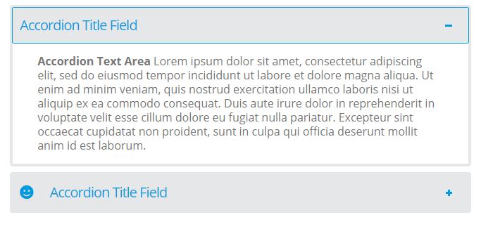
- Section Placement: This block can be placed in one-column, two-column, or three-column sections.
- Configure Block:
- Title*: Required field - this is the text that displays on the accordion drawer.
- Display Title Checkbox: 'Display Title' is always required for accordions.
- Text Area: Add/format your content using the WYSIWYG editor
- Icon: (Optional): Use this field to add an icon to the Accordion drawer. Start typing the name of the icon and select from the auto-complete list. Leave blank if no icon is needed.
Call To Action
- Use this block to create a banner call to action with adjustable background color and button.
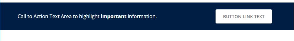
- Section Placement: This block is best placed in a one-column "full" width section.
- Configure Block:
- Title*: Recommended for internal purposes only on Call To Action block type.
- Display Title Checkbox: Always uncheck "Display Title" for this block type.
- Background Color: Select your background color from the color palette options.
- Text Area: Add/format your call to action using the WYSIWYG editor.
- Button (URL):
- For internal links, start typing the name of the page.
- For external links, insert the full URL.
- Leave blank if you don't want to display a button
- Button (Link Text):
- Type the text you want to display on the button/link.
- Leave blank if you don't want to display a button
Card - Image Top
- Use to display a series of related items with an image, title, brief descriptive text, and button. Each image card is added separately.
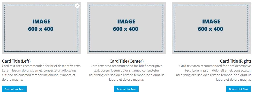
- Section Placement: Recommended for use in three-column or four-column sections.
- Configure Block:
- Title*: Recommended for display purposes.
- Display Title: Title is optional for this block type.
- Alignment: Default (Left). Option to select Center of Left to adjust the placement of Title, Text Area, and Button.
- Image: Suggested image dimensions 600w x 400h.
- Text Area: Add/format your content using the WYSIWYG editor
- Button (URL):
- For internal links, start typing the name of the page.
- For external links, insert the full URL.
- Leave blank if you don't want to display a button
- Button (Link Text):
- Type the text you want to display on the button/link.
- Leave blank if you don't want to display a button
Hero
- Use for creating a hero or slider experience at the top of a page. Image overlay treatment can include intro text, main title, additional text, and button. Adjust the title placement based on the image focal point.
- If you want to add multiple hero slides to a page, the section configuration should have "Is this is a slider" set to 'yes'.
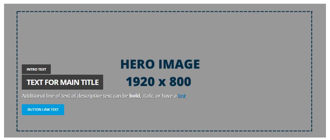
- Section Placement: For use in one-column full-width sections only. Note: If you want to have more than one hero image available edit the section and change 'Is this a slider' to "Yes".
- Configure Block:
- Title*: Text for Main Page Title
- Display Title: Checked. Required for this block type.
- Text Field: Intro Text - Can be used as a smaller line of text above the main title.
- Image: Suggested image dimensions 1920w x 800h.
- Quadrant: Set the placement of the text area based on your image focal point - Left, Right, Center and Top, Middle Bottom options.
- Text Area: Use this field to enter an additional line of brief descriptive text
- Button (URL): - Use to link the Hero slide to a new page.
- For internal links, start typing the name of the page.
- For external links, insert the full URL.
- Leave blank if you don't want to display a button
- Button (Link Text):
- Type the text you want to display on the button/link.
- Leave blank if you don't want to display a button
Hours of Operation
- Use this block to consistently display daily hours of operation. If multiple schedules need to be displayed at the same time (i.e. Holidays/Breaks), add additional hours of operation blocks individually.
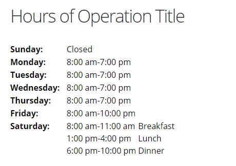
- Section Placement: Recommended for use in two-column, three-column, or four-column sections.
- Configure Block:
- Title*: Optional.
- Display Title: Optional.
- Hours of Operation:
- Use drop down fields to indicate hours, minutes and AM/PM for each day.
- Comment: Use to write special notes or indicate a location is closed for the day.
- Add Time Slot: Use to add multiple time slots to a specific day if there is a break in hours of operations or type of foods available at different times.
- Copy previous day: Use to quickly copy times from a previous day for days with the same hours.
Icon
- Use this block type to incorporate an icon into your layout. This block allows for two different icon treatments: Default and Icon List.
Default:
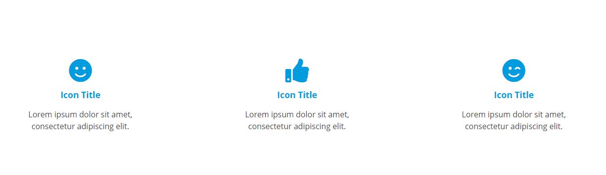
- Section Placement: Recommended for use in three-column or four-column sections.
- Configure Block:
- Title*: Recommended for default, serves as link text, if including an Icon Link.
- Display Title: Recommended for default if including link.
- Icon: Start typing the name of the FontAwesome Icon, select the icon from the auto-complete list.
- URL: If linking to an internal page, simply start typing the name of the page and select it from the auto-complete list. If linking to an external site, include the full URL such as: https://example.com.
- Icon Color: Choose a color from the approved palette. Default (penn-sky) is recommended.
- Text Area: Use this field to enter an additional line of brief descriptive text
- View Mode: Default
Icon List
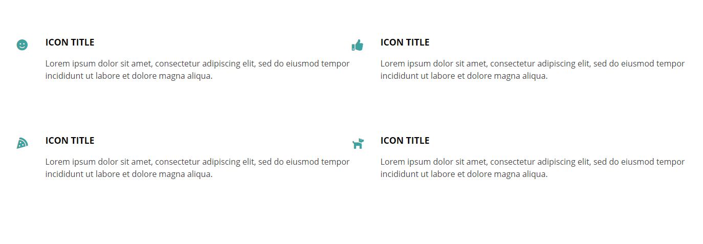
- Section Placement: Recommended for use in two-column, three-column or four-column sections.
- Configure Block:
- Title*: Optional for Icon List.
- Display Title: Optional.
- Icon: Start typing the name of the FontAwesome Icon, select the icon from the auto-complete list.
- URL: If linking to an internal page, simply start typing the name of the page and select it from the auto-complete list. If linking to an external site, include the full URL such as: https://example.com.
- Icon Color: Choose a color from the approved palette.
- Text Area: Use this field to enter an additional line of brief descriptive text
- View Mode: Icon List
Image Carousel
- Use this block to incorporate multiple images into a carousel, which can be rotated through and/or clicked on for a larger view. This block allows for two different carousel treatments: Default and Thumbnail Navigation.
Default
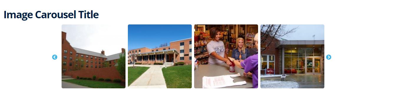
- Section Placement: Recommended for use in one column, or multi-column placement.
- Configure Block:
- Title*: Required field with the option to display or hide.
- Display Title: Optional.
- Image Carousel Items: Choose the number of items you want to display in your carousel. It is recommended to set this number to one less than the total number of images you want to include.
- Image: Click "Add Media" and search/select from the existing image options or click "Choose Files" to upload and insert a new file. You can add multiple images at the same time.
- View Mode: Default
Thumbnail Gallery
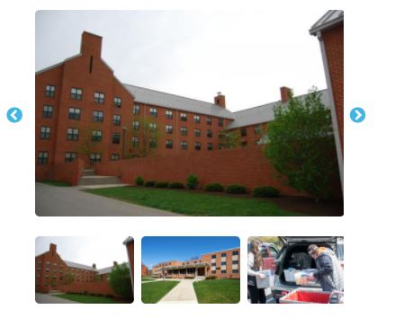
- Section Placement: Recommended for use in two-column or three-column placement.
- Configure Block:
- Title*: Required field with the option to display or hide.
- Display Title: Optional.
- Image Carousel Items: This setting is not applicable to this view type.
- Image: Click "Add Media" and search/select from the existing image options or click "Choose Files" to upload and insert a new file. You can add multiple images at the same time.
- View Mode: Image Carousel - Thumbnail Gallery
Map
- Use this block to insert a variety of map types into your layout. Map type options include: Static Concept 3D Map, Static Custom Image Map, Near Me Map and Interactive Map.
Static Concept 3D Map:
- Section Placement: Recommended for use in three-column or four-column placement. Note: The size of this map block is always a X x X square.
- Configure Block:
- Title*: Required field with the option to display or hide.
- Display Title: Optional.
- Map Type: Static Concept3D Image
- Map URL: This is the "Share" link from the Concept3D map experience where you would like the user to land on the map when the static image is clicked.
- Image URL: This URL needs to be formatted according to the Concept3D static map structure. Replace the bold values in the example for map & location id. https://staticmap.concept3d.com/map/static-map/?map=1134&loc=273818
- Link Text: This should be the location name and will be added as a caption to the image and used for assistive technology.
Static Custom Image Map:
- Section Placement: Recommended for use in one-column placement. Note: The size of this map block is always a 1310w x 350h rectangle.
- Configure Block:
- Title*: Required field with the option to display or hide.
- Display Title: Optional.
- Map Type: Static Custom Image Map
- Map URL: This is the "Share" link from the Concept3D map experience where you would like the user to land when the static image is clicked.
- Image: Upload a screen shot of the desired location on your Concept3D map.
Quick Links
- Section Placement: Recommended for use in multi-column placement no wider than 33%.
- Configure Block:
- Title*: Required field with the option to display or hide.
- Display Title: Optional.
- URL: Start typing the name of an internal link or add a fully qualified URL for external links.
- Link Text: The text you want to display in the Quick Link list
- Click Add Another Item and repeat as needed
- Click Add Block
Simple Image
- Section Placement: Recommended for use in multi-column placement.
- Configure Block:
- Title*: Required field with the option to display or hide.
- Display Title: Most likely you will want to uncheck this setting for images.
- Image: Click "Add Media" and search/select from the existing image options or click "Choose Files" to upload and insert a new file.
- Image Border: Choose from Square or Circle treatment, default is square.
- Block Level Padding: Padding is applied to the inside of your element affecting how far your element's content is away from the border.
Card - Staff
- Use to create a staff directory item with name, image, title, email, phone, and brief descriptive text (optional). Each staff card is added separately.
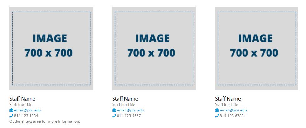
- Section Placement: Recommended for use in three-column or four-column sections only.
- Configure Block:
- Title*: Staff Name
- Display Title: Checked. Required to display Staff Name.
- Image: Suggested image dimensions 700w x 700h.
- Text Field: Job Title. Use this field to enter the staff member's title.
- Email: Use this field to enter the staff member's email address
- Phone: Use this field to enter the staff member's phone number
- Text Area: Optional text area for more information.