
BJC Next Gen User Guide
Content Types
Section Types
- Callout Box Section - Button
- Callout Box Section - Image
- Event Spaces Section
- Image / Text Section
- Seating Chart Section
- Promotional Banner Section
- Listed Table Section
- Listed Item Section
- Accordion Item Section
- Text Block Section
- Social Banner Section
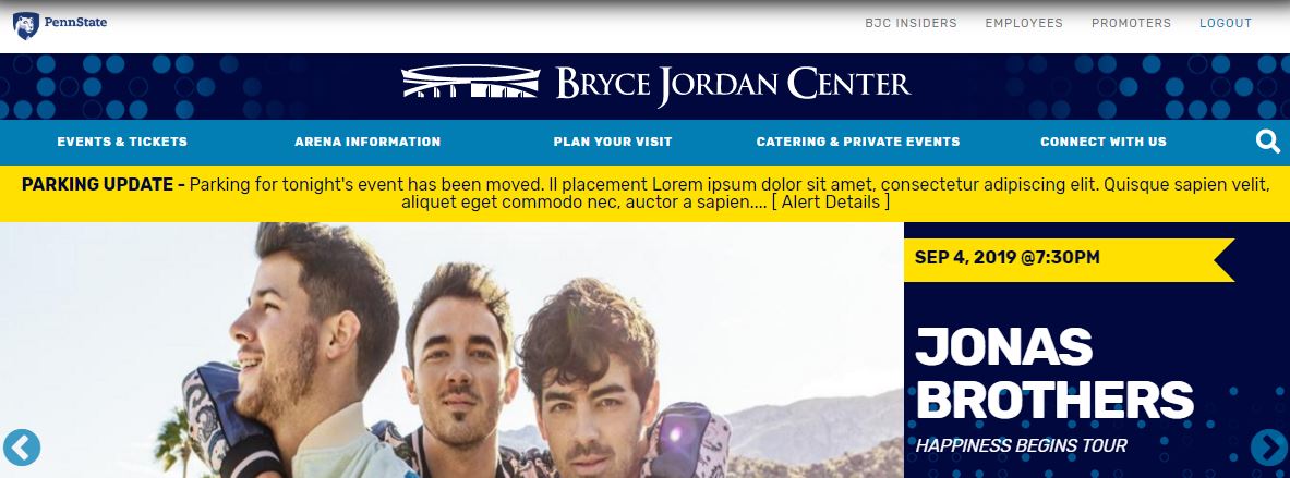
Events
- Using the Content tab, filter by the Event content type select the appropriate event template to start from: Entertainment, Athletic - Men's, Athletic - Women's, Unticketed, Private Event
- Click Replicate
- Edit the Title for the name of the event. (Longer event names can utilize the Intro Title and Sub Title fields.)
- Add the Main Event Image image by clicking Choose File and selecting the image from your computer
- Click Upload and add the appropriate Alternate Text.
- Add your artist/event description to the Event Summary/Description field
- Edit the Event Sections as necessary:
- Event Callout Boxes (non-editable)
- The details of this section cannot be edited, but if the event does not have a seating chart or student tickets, you should remove the entire section.
- More Information (Listed Table Section)
- Default content includes information such as: Ticket Sales, Student Tickets, Premium Seating, Accessible Seating
- Be sure to check/update Ticketmaster links for each event.
- You can add or remove additional Listed Table Items as needed.
- Get Ready (Promotional Banner Section)
- This section shouldn't need to be edited often, but if need be you can add/remove any of the Promo Icon items: Get There, Get Parking, Get Food, Get Sleep
- Things You Should Know (Accordion Item Section)
- Default content includes standard policy information: Bag Policy, Camera Policy, Parking Policy, Alcohol Policy, Allergen Warning
- You can add, remove, or edit the Accordion Items as needed.
- Using the left menu bar, click the Event Details tab. There is where you will input the following information:
- Select the Type of Event using the dropdown
- For Athletic Events only, choose the correct sport from the Athletic Event Type dropdown.
- Dates and Time:
- Enter the event date, start time and door time
- Click Add another Date and Time if your event has multiple dates
- Ticket Details:
- Alternate Ticket Text (this text will override the "Buy Tickets" text) - Note: A Link must be provided in the Ticket Link field in order for this text to display.
- Ticket Link
- Set Ticket Sale Date & Time
- Input Base and Max ticket price
- Student Ticket Link
- Set Student Ticket Sale Date & Time
- Seating Chart Image:
- Upload the event-specific seating chart
- Event Placement
- Use checkboxes to indicate where the event should display
- Note: If all "Featured" and "Upcoming" event spaces are taken, this event won't display until a spot becomes available or another event is unchecked.
- Private Events are automatically excluded from the "Homepage Carousel, Featured, and Upcoming" options. Use the "Remove from Homepage Calendar" checkbox to exclude the event from displaying on the homepage calendar widget.
- Active Entrances
- Use checkboxes to display accordingly
Using the left menu bar, click the Scheduling Options tab to set the publish date and time or click the Publishing Options and check Published to publish now.
Set the Primary homepage graphic:
- Using the left menu bar, click the Publishing Options tab and check Sticky at Top of Lists. Note: If multiple events are marked as Sticky at Top of Lists, they will display in chronological order based on the event date.
A-Z Guide
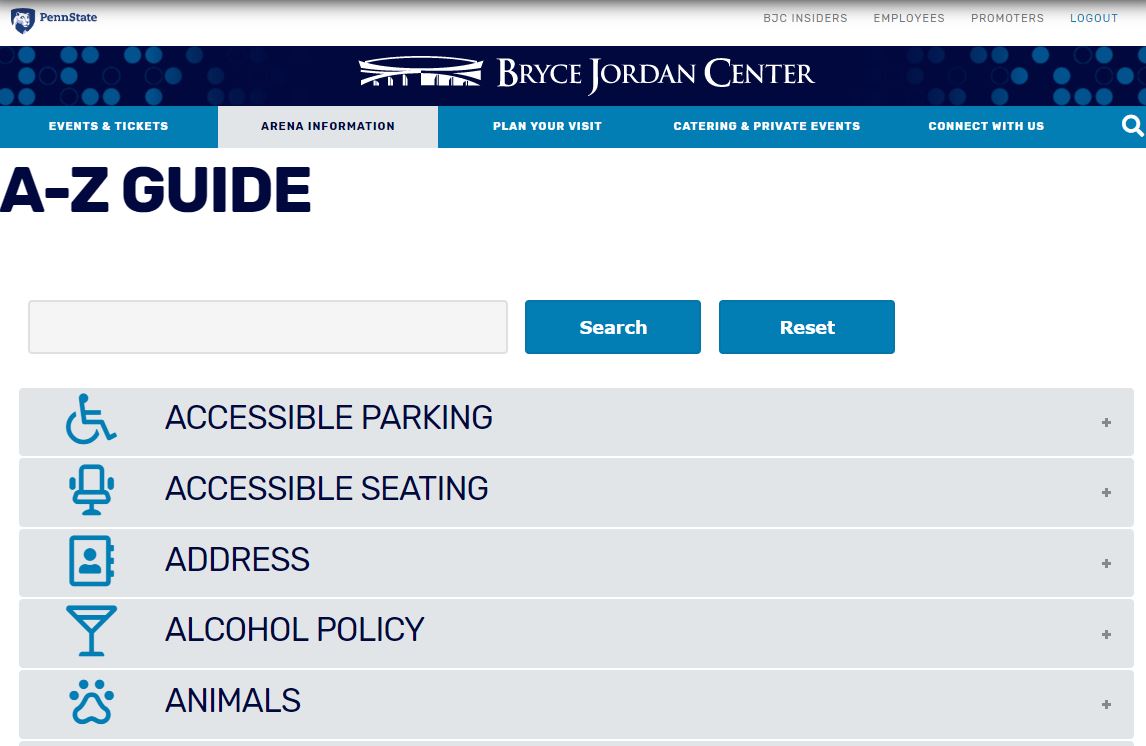
To add a new item to the A-Z guide, use the A-Z Guide Content Type.
- Select an Icon from the dropdown list
- Add a Title - this will display on the collapsed accordion
- Add a Description - This will display when the accordion is expanded
To edit an exiting A-Z Guide Item:
- While logged in to the site, navigate to the A-Z guide page
- Expand the item you want to edit and click Edit
or you can filter the Content type by A-Z Guide and search for the individual item in the list.
Alerts
To add a new Alert, use the Alert Content Type.
- Add a Title - this will display in bold before your alert message
- Set the Date and Time you would like your alert to unpublish
- Select the Placement for where you would like your alert to display
- Add your alert message in the Body field
- If the alert message is longer than 150 characters, the alert banner will include the first 150 characters followed by an [Alert Details] link which will display the full alert.
Articles
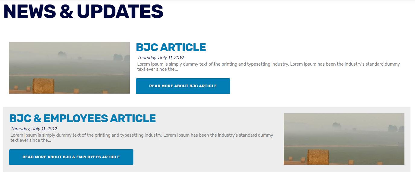
To add a new Article, use the Article Content Type.
- Add a Title
- Upload a Hero Image (Optional)
- Add your article content to the Body field
- Optional - Click Edit Summary to include a specific line of text when the article displays on the news page. If left blank, a trimmed version of the full text will be used as the summary.
- Set the Article Date - this will be printed on the article and used to arrange articles in chronological order
- Select the Placement for where you would like your alert to display
Portal Pages
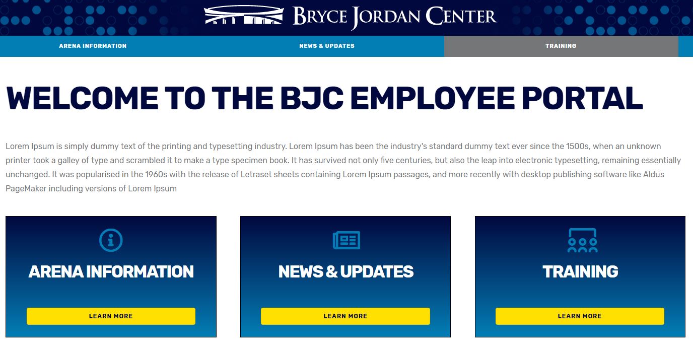
To add a page to one of the portals, use the individual portal Content Type: Portal - BJC Insiders, Portal - Employees, Portal - Promoters. Once selected, this content type functions the same as a regular "Page".
- Upload a Hero Image (Optional)
- Add a Title - this will be displayed as the page title and determine the URL path
- Choose which section(s) you'd like to add to build the page content
To have your new page display in the Portal Menu structure:
- Using the left menu bar, click the Menu Settings tab
- Check the Provide a menu link box
- Select the Parent Item from the dropdown box
To have your new page display as a callout box on the Portal Homepage:
- Using the left menu bar, click the Home Page Settings tab
- Check the Promote to Employee Home box
- Select the Icon to display in the Callout Box using the dropdown list
- Add a brief line of text to the Section Introduction field (optional)
To sort the order of the Callout Boxes on the Portal Homepages, use the following URLs:
/employees-sort
/bjc-insiders-sort
/promoters-sort
Photo Gallery
To add a new Photo Gallery, use the Gallery Content Type.
- Add a Title
- Add the Year of the event
- Add the Concert Date
- Upload a Gallery Cover Image - this will display as a thumbnail on the Photo Gallery landing page
- Upload your Gallery Images (Note: You will need to re-add the cover image if you want it to display in the gallery)
- (Optional) Use the Body field to include a brief write-up or recap of the event.
Icon
To add a new Icon to the available Icon dropdown list, use the Icon content type
- Visit Fontaweome.com to browse available icons (The BJC Design Guide recommends the "Regular" style)
- Copy the Icon Code following the '<i-class=' from the individual icon page
- Add a Title for the Icon - this is the name that will display in the dropdown list
- Input the Icon Code. Please do not include the HTML icon tags. For example, this would be the proper formatting for this field: far fa-accessible-icon
Menu Category
To add a new Category to the Catering Menu, use the Menu Category content type
- Add a Title
- Upload a Menu Category Image - this will display when the menu category is expanded
To sort or re-order the menu categories visit /bjc-catering-sort
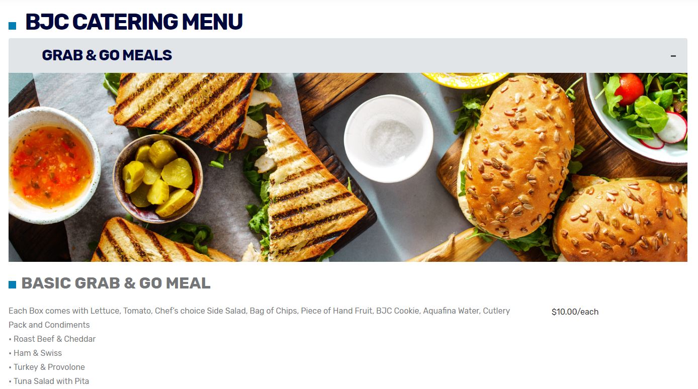
Menu Item
To add a new item to the Catering Menu, use the Menu Item content type
- Add a Title
- Select the Menu Category from the dropdown list
- Add the Item details to the Description field
- Add Price as you would like it displayed (i.e. include $ sign)
Callout Box Section - Button
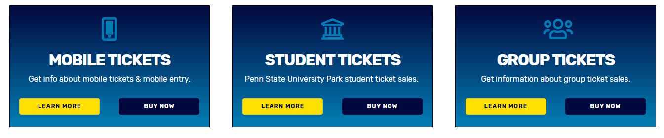
1. Using the Section Type dropdown menu, select Callout Boxes Section - Button and click Add New Section
Section Fields and Settings:
Section Title (Optional)
- Add text to title your section
Section Introduction (Optional)
- Add a brief text intro/description for your section
List Display Options:
- Select from Two Column or Three Column display
Click Add new Callout Box Button
- Select an Icon (optional)
- Add a Callout Title
- Add a Callout Description
- Add text to display on Callout Button(s)
- Add link for Callout Button(s) - for internal URLs just use the pathname. For example: bjc.psu.edu/ticket-information would just be input as /ticket-information.
Click Add another Callout Box Button
- Repeat steps to add an Icon, Callout Title and Callout Description
Section Closing (Optional)
- Add a brief line of text at the end of this section
Callout Box Section - Image
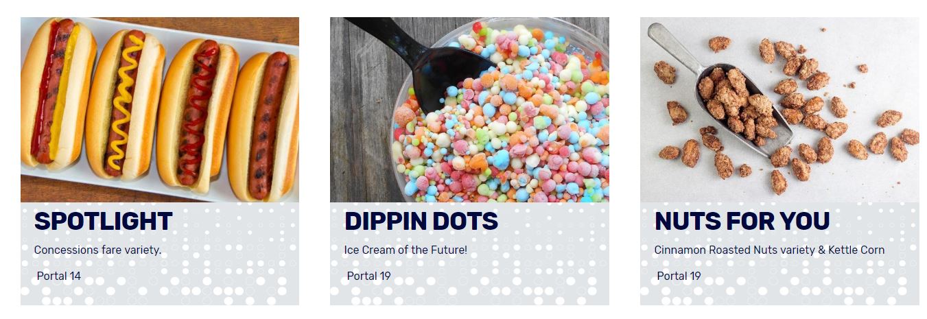
Using the Section Type dropdown menu, select Callout Boxes Section - Image and click Add New Section
Section Fields and Settings:
Section Title (Optional)
- Add text to title your section
Section Introduction (Optional)
- Add a brief text intro/description for your section
List Display Options:
- Select from Two Column or Three Column display
Click Add new Callout Box Image
- Add the Callout Image by clicking Choose File and selecting the image from your computer.
- Click Upload and add the appropriate Alternate Text.
- Add the Callout Image Link (optional) - for internal URLs just use the pathname. For example: bjc.psu.edu/ticket-information would just be input as /ticket-information.
- Add a Callout Title
- Add a Callout Description
Click Add another Callout Box Image
- Repeat steps to add an Icon, Callout Title and Callout Description
Section Closing (Optional)
- Add a brief line of text at the end of this section
Event Spaces Section
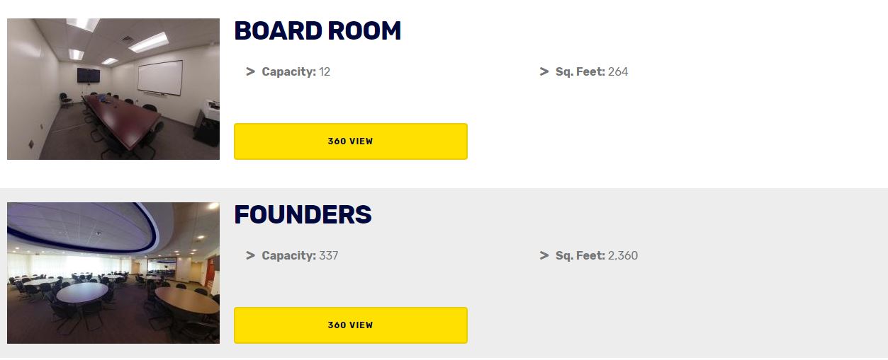
Using the Section Type dropdown menu, select Event Spaces Section and click Add New Section
Section Fields and Settings:
Section Title (Optional)
- Add text to title your section
Section Introduction (Optional)
- Add a brief text intro/description for your section
Click Add new Event Space
- Add the Event Space Image by clicking Choose File and selecting the image from your computer.
- Click Upload and add the appropriate Alternate Text.
- Add an Item Title
- Add Capacity
- Add Square Feet
- Add Details
- Add 360 Image Link
Click Add another Event Space
- Repeat steps to add an Icon, Callout Title and Callout Description
Section Closing (Optional)
- Add a brief line of text at the end of this section
Image/Text Section
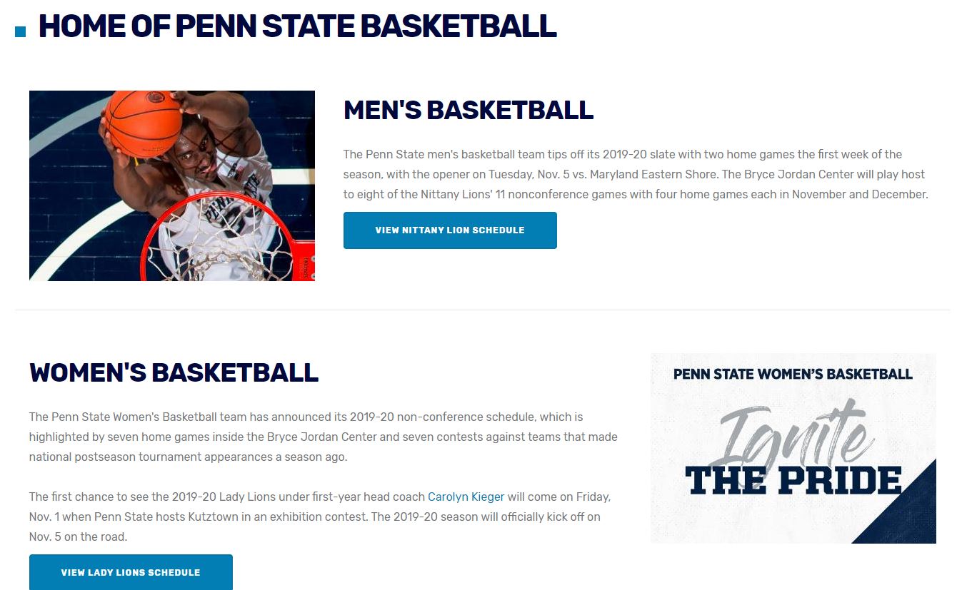
Using the Section Type dropdown menu, select Image/Text Section and click Add New Section
Section Fields and Settings:
Section Title (Optional)
- Add text to title your section
Section Introduction (Optional)
- Add a brief text intro/description for your section
Separator Display Options:
- Select from Stripes (alternating sections of white and gray backgrounds) or Line Separator (thin gray lines between sections) display
Click Add new Image/Text Item
- Set your image alignment to display to the left or right of the text
- Add the Image by clicking Choose File and selecting the image from your computer.
- Click Upload and add the appropriate Alternate Text.
- Add an Item Title
- Add an Item Description
Click Add another Image/Text Item
- Repeat steps to add an Image, Title and Description
Section Closing (Optional)
- Add a brief line of text at the end of this section
Seating Chart Section
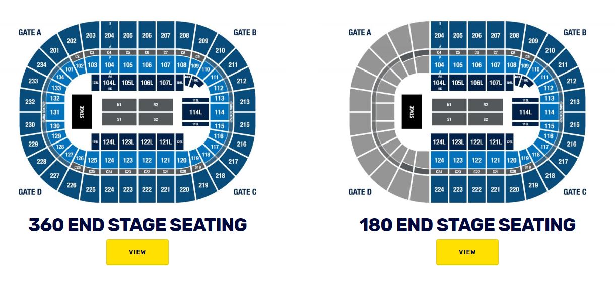
Using the Section Type dropdown menu, select Seating Chart Section and click Add New Section
Section Fields and Settings:
Section Title (Optional)
- Add text to title your section
Section Introduction (Optional)
- Add a brief text intro/description for your section
Click Add new Seating Chart
- Add the Seating Chart Image by clicking Choose File and selecting the image from your computer.
- Click Upload and add the appropriate Alternate Text.
- Add an Item Title
- Optional: If the seating chart or floorplan has an accompanying 360 Image, you can add the URL to the 360 Image Link field.
Click Add another Seating Chart
- Repeat steps to add an Icon, Callout Title and Callout Description
Section Closing (Optional)
- Add a brief line of text at the end of this section
Promotional Banner Section
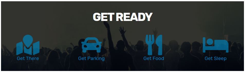
Using the Section Type dropdown menu, select Promotional Banner Section and click Add New Section
Section Fields and Settings:
Alignment
- This setting can be used to indicate the alignment for your Section Title and Section Introduction
Banner Background Image (1440 x 400) - (1440 x 600)
- Add the Background Image by clicking Choose File and selecting the image from your computer.
- Click Upload and add the appropriate Alternate Text.
Section Title (Optional)
- Add text to title your section
Section Introduction (Optional)
- Add a brief text intro/description for your section. You can also use this space to add a button using the button templates.
Click Add new Promotional Icon
- You can upload a custom logo or choose an available icon
- Add an Item Title
- Add a Link to your Icon/Logo
- Optional: add a subtitle text to display below the Icon and Title
Click Add another Promotional Icon
- Repeat steps to add a Logo/Icon, Title and Link
Listed Table Section
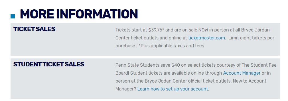
Using the Section Type dropdown menu, select Listed Table Section and click Add New Section
Section Fields and Settings:
Section Title (Optional)
- Add text to title your section
Section Introduction (Optional)
- Add a brief text intro/description for your section
Click Add a new Listed Table Item
- Add a Listed Table Item Title, this will display on the left side of the table
- Add Listed Table Item Content, this will display on the right side of the table
Click Add another Listed Table Item:
- Repeat steps to add item title and content
Section Closing (Optional)
- Add a brief line of text at the end of this section
Listed Item Section
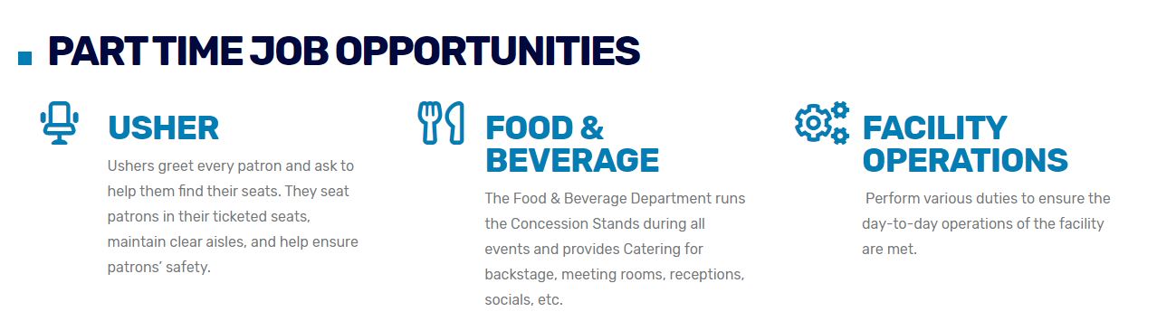
- Using the Section Type dropdown menu, select Listed Items Section and click Add New Section
Section Fields and Settings:
Alignment
- This setting can be used to indicate the alignment for your Section Title and Section Introduction
Section Title (Optional)
- Add text to title your section
Section Introduction (Optional)
- Add a brief text intro/description for your section
Display Option
- This setting allows you to select from Two-Column or Three-Column list type
Add a new List Item:
- Click Add a new List Item
- Select an Icon
- Add content/description for your listed item
Add another List Item:
- Click Add another List Item
- Repeat steps to add an Icon, content and item description
Remove a List Item:
- Click Remove
- Click Confirm Deletion to permanently delete this content
Accordion Section
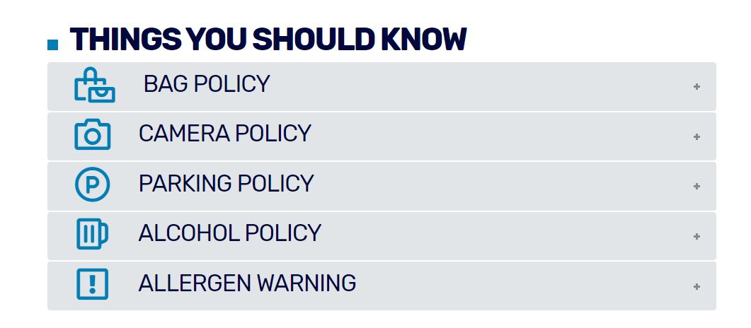
Using the Section Type dropdown menu, select Accordion Item Section and click Add New Section
Section Fields and Settings:
Section Title (Optional)
- Add text to title your section
Section Introduction (Optional)
- Add a brief text intro/description for your section
Click Add new Accordion Item
- Select an Icon for your item (optional)
- Add an Item Title
- Add an Item Description
Click Add another Accordion Item
- Repeat steps to add an Icon, Title and Description
Section Closing (Optional)
- Add a brief line of text at the end of this section
Text Block Section
- Using the Section Type dropdown menu, select Text Block Section and click Add New Section
Section Fields and Settings:
Alignment
- This setting can be used to indicate the alignment for your Section Title and Text Block
Section Title (Optional)
- Add text to title your section
Text Block
- Add content to the text block. The section functions the same as the "Body" section of the Drupal sites.
Social Banner Section
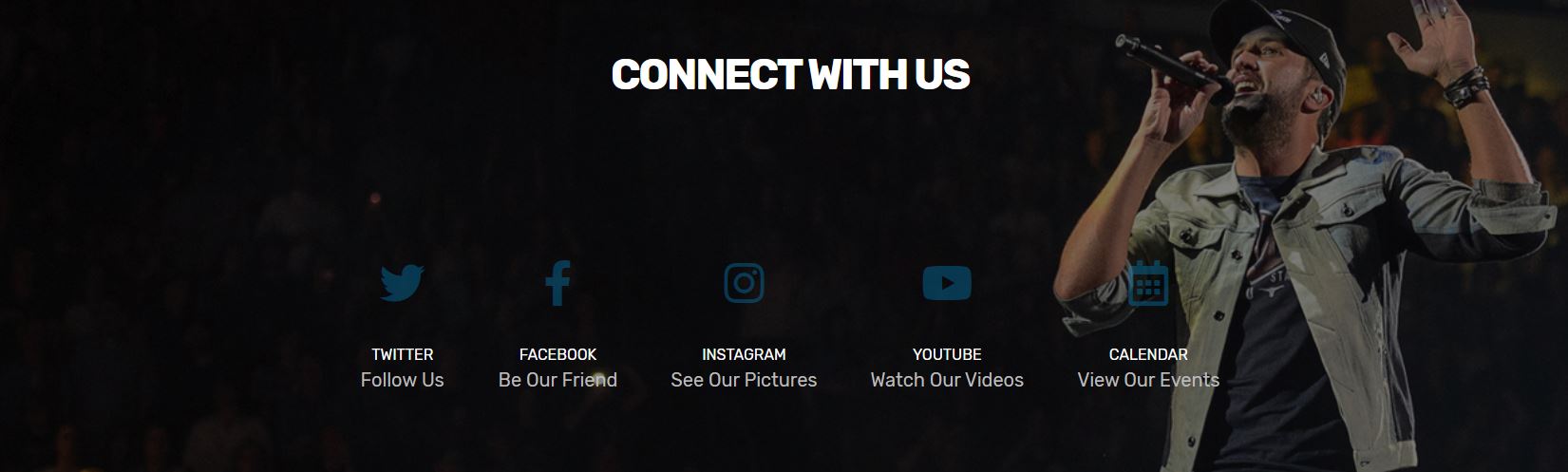
Section Fields and Settings:
Alignment
- Use this dropdown to indicate the alignment for your Section Title and Section Introduction
- Default: Center Alignment
Banner Background Image (1440 x 400)
- Select the hero image by clicking Choose File and selecting the background image from your computer
- Click Upload
- Add the appropriate Alternate Text
Section Title (Optional)
- Add text to title your section
Section Introduction (Optional)
- Add a brief text intro/description for your section
Click Add new Social Network*
- Select a Social Network Icon
- Add a direct link to social network page/account
- Add a text description/call to action for that social network (i.e. For Facebook use, "Be our Friend")
*If the Social Network platform you'd like to add isn't currently available in the dropdown list, contact [email protected].
Remove a Social Network:
- Click Remove
- Click Confirm Deletion to permanently delete this content